Business card design · Real estate
STONEBRIGE REALTY
A considered first impression, in black and white.
The project
A clear hierarchy.
A cohesive impression.
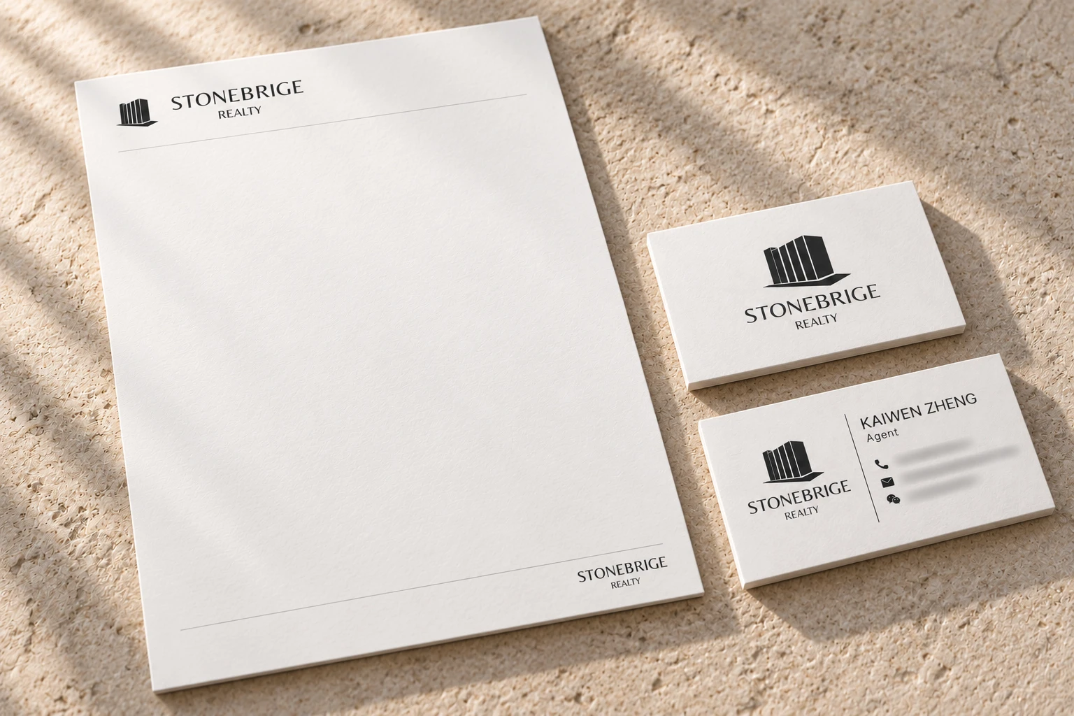
A business card design for STONEBRIGE REALTY, combining architectural imagery, clear typography, and a restrained black-and-white palette. The layout creates a clear hierarchy between the brand, the agent’s name, and contact details.
A coordinating letterhead concept extends the design across printed materials.
- Focus
- Business card design
- Extension
- Letterhead concept
01 / Business cards
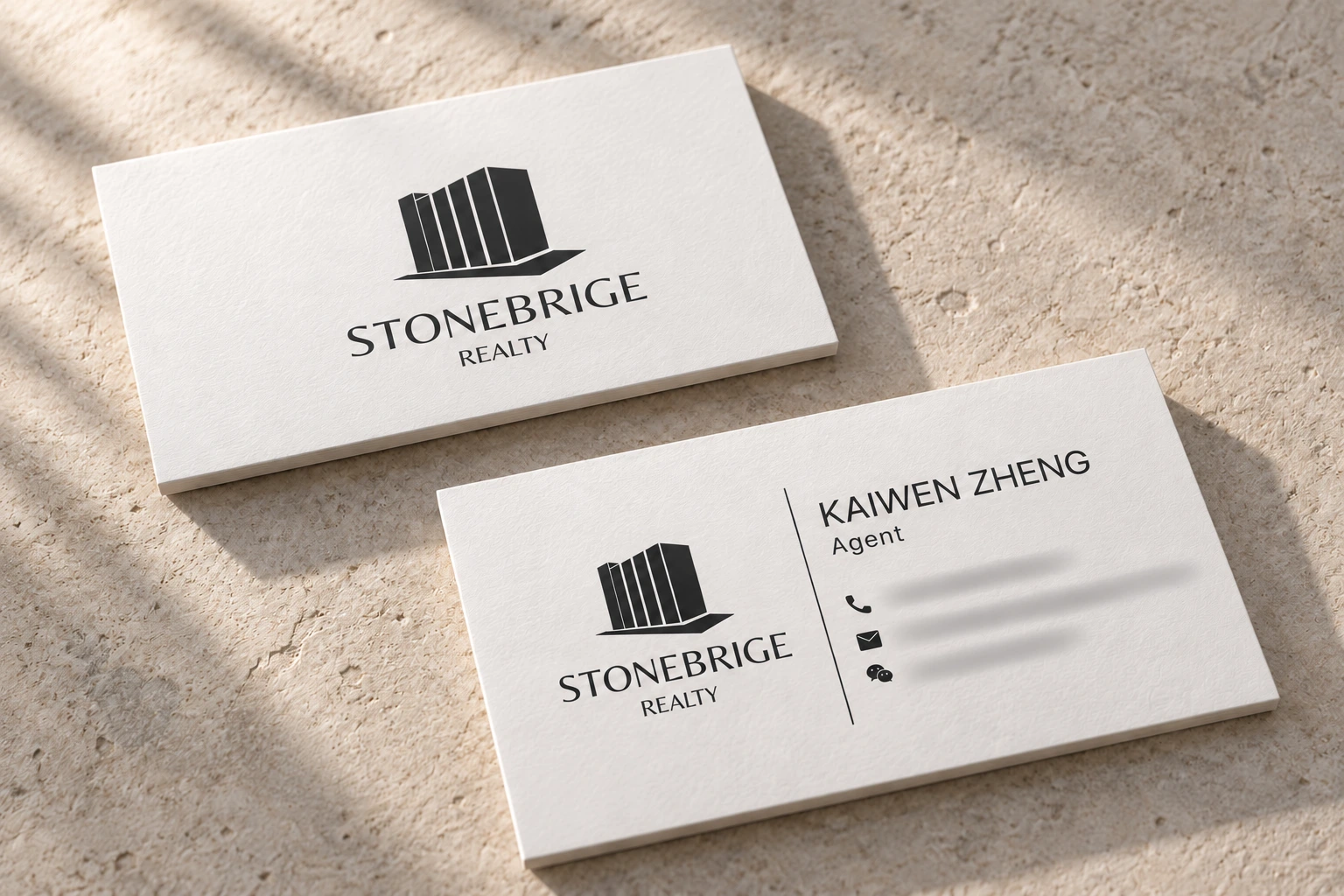
Two sides. One visual language.
A vertical rule separates the brand from the agent’s details. The reverse gives the architectural mark room to stand on its own.


02 / Visual details
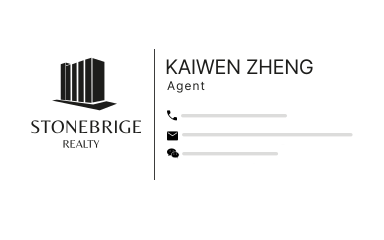
An architectural presence.
The stepped building silhouette and expressive wordmark anchor the layout. Simple contact icons, a fine dividing line, and generous white space keep the information easy to scan.
03 / Stationery concept
Carrying the design into correspondence.
A matching letterhead concept uses the same mark and fine rules, leaving a generous area for correspondence.